Posts

Portfolio 2

Image
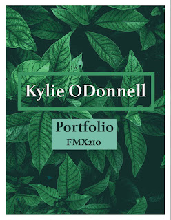
I redid my portfolio and I like the outcome much better. This portfolio is a more sleek and  professional version. I used the image of the green leaves and then drew colors from that. The format is sort of geometric with all squares and rectangles.

Portfolio

Image
 sketches; I wanted my portfolio to be simplistic so that it would not take away from the actual work being presented. I used my three favorite colors in a pastel form to make the portfolio simple, but still eye catching.  I feel the font I chose is professional but unique. I gave my somewhere project its own page because it is my favorite work. I made my logo brush tag the back page to tie it all together. 

Business cards

Image
 My three business cards are above. They all use a different version of my color logo. The first one has the blue and pink color theme. The second one uses the black and white logo with a pastel background. The third one uses the rainbow color theme. All have my email, phone number, and instagram. The instagram was added because that is one of the best places to reach me. My favorite business card is the second one that is pastel.  sketches;

somewhere project

Image
original image   Image I took final image My somewhere project is a photo of me in a scene from the mean girls movie. This is one of my favorite movies. I dressed up in clothing that i felt fitted the scene and took a photo posing in a similar way as the girls. I placed myself to the right of the girls because there was a lot of extra space. I included my brush tag on the cup I am holding. I changed the settings on my photo to try and make it fit better in the scene. I also added a white brush stroke and changed the type of mask it was to make it look like the light that is peeking through from the back of the photo.

Somewhere

Image
  I think this image would be really hard to photoshop myself into because there isn't much space where a person to be added and the shadows would probably make it really hard to add another person to the image.  This photo gave me inspiration for my somewhere project. The man puts himself into the photo in a unique way. I would not have thought to put myself inside of the box. This one made me laugh. I just think the way her legs look is so funny. I would like to recreate this illusion. I think this makes a cool illusion and is a creative photo. It looks easy to recreate and is a fun idea. 

Autoscopy

Image
original;  This is my autoscopy self-portrait. It includes a photo of me on a chair. I removed the background on the photo of me. I put myself and the chair on a photo of the ocean. I changed some filters to make the ocean darker. I then put a photo of the starry night sky above the ocean. I put dolphins in the ocean. I then put the alien and planets in the sky and changed the filters on those as well. The photo of the alien was a stock photo so I also had to remove the watermark. I then changed the color of my pants and the color of my hair. Finally I added my logo to the corner.

BW to color

Image
 For my BW to color I used an image of me in front of the riverwalk. I used the triad, compound, and split complimentary color palettes from adobe color for my color schemes. For the first image I wanted to be outside the box, so i made my skin pink, hair blue, and eyes yellow, making the image very interesting. The second image is my favorite one, I really like the colors and the way it turned out.